How Top Video Creators Turn Simple Views Into 7-Figure Businesses
We break it all down on The Video Creatr Show, click the link below.

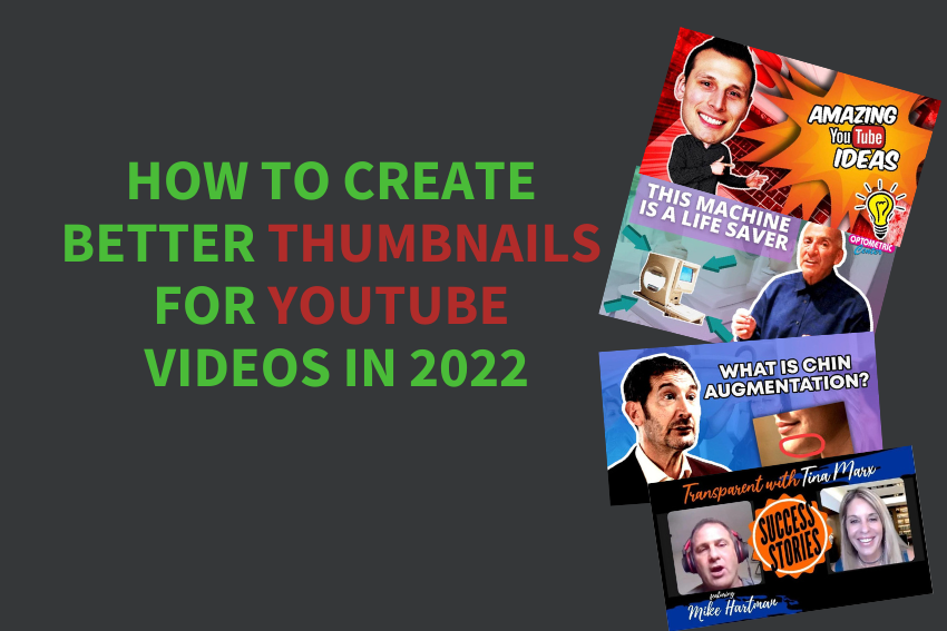
In today’s crowded YouTube environment, high-quality content may not be enough to stand out amongst the ever-growing competition. It would help if you worked consistently to increase your views and gain more subscribers. Creating customized YouTube thumbnails could help you make a difference in your viewership.
YouTube thumbnails are small images that give viewers a peek into everything inside an uploaded video. Thumbnails that pique your video’s attention will work best for you. In essence, thumbnails serve as greeting cards for your videos.
Not sure about the value of thumbnails? Consider how thumbnail images impacted your decision about watching YouTube videos.
Why are YouTube thumbnails Essential?
Today’s YouTube landscape has videos for every possible topic. Creating eye-catching thumbnails ensures that your videos stand out from the crowd. Besides, YouTube also has multiple videos on the same issues.
Your thumbnails are the first impressions viewers get when they explore your videos. They play a vital role in getting you traffic and watch time. Well-crafted thumbnails give a positive image and urge clients to click on your YouTube videos.
Given that YouTube is essentially a visual platform, most viewers will notice your thumbnails before they consider your video’s title. Avid YouTubers work on engaging viewers with their thumbnails.
Are you wondering about how to create better thumbnails? Read on for top tips and suggestions that can help you enhance your YouTube video thumbnails.
Use Existing Thumbnails to Settle on your Style
Take some time to study other people’s thumbnails. Assess the different styles from a viewer’s point of view. Find out which styles appeal most to you and those that you’d rather not look at. Such information will reveal what will work best for you and what may not.
Also, you could do YouTube searches on your topic to know what you’ll be coming up against. Doing your homework on what is already available will help you understand how to set up your thumbnails.
It is also essential to remember that one style won’t apply to all video genres. Assess your specific genre and settle on a style that yields positive results and returns from clients.
Keep your Thumbnails As Simple As Possible
Viewers often click instinctively without much thought to what they are doing. Will a viewer get complete information regarding your thumbnail in less than a second? Will they need more time to comprehend your thumbnail?
Go for simplicity and conciseness if you want to appeal to your audience. Most viewers simply react to your thumbnails rather than reading and analyzing them. Keep them short and meaningful to ensure that your viewers want to view your YouTube videos.
Make the most of the Thumbnail’s Three Zones
Viewers often read from top to bottom or left to right. Generally, a thumbnail’s essential zones are the left, right, and center. You could place a specific object in the center where most people focus. Also, placing faces at the center may yield excellent results.
While you may have to work with limited space, don’t fall into the temptation of placing essential elements on the edges. However, you won’t cause much harm if your background spills over to the thumbnail’s edges.
Create Conspicuous Thumbnails
While this suggestion might be subjective, there are multiple ways of creating thumbnails that stand out from the crowd. First, you could opt for high-contrast colors. Such colors make it easier for you to differentiate various thumbnail elements. Ensure that your background color doesn’t overshadow everything else going on with the thumbnails.
Also, consider using background removers that allow you to place considerable focus on other objects. Halo effects will work perfectly with these removers, especially if you put them around objects and subjects.
If your thumbnail has a photo or video image, ensure that the brightness, color saturation, and contrast are top-notch. Exaggerating these aspects ensures that your thumbnail pops. Only remember that specific genres might require subtle colors.
Try to use less text to complement rather than substitute the main text. The main idea is to identify the video’s central theme then emphasize it. Using less text also lets you blow up its size.
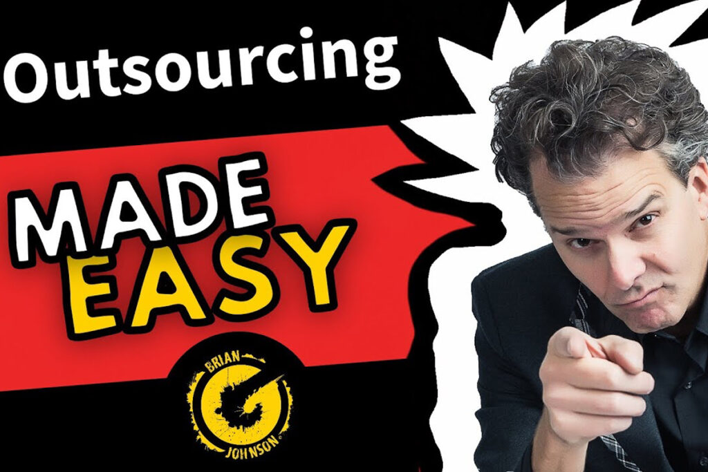
If you intend to use images of people, go for more face and less body. Viewers often tend to take a keen interest in faces. While some YouTubers might show more shoulders and torso, these parts may not give you the desired results. They might be counterproductive.
Ensure that your Thumbnails Emit Energy and Motion
Although it’s nearly impossible to animate thumbnails, you could tilt the text, images, or icons. On the other hand, high-contrast ensures that you emphasize specific aspects. For energy, you could work with lightning or subtle explosions.
In certain instances, lettering effects and fonts could do the trick. Only ensure that whatever you settle for blends seamlessly with your genre.
Create Responsive and Mobile Friendly Thumbnails
Design all your thumbnails with mobile viewing capabilities in mind. As most of your viewers use mobile phones, ensure that you create thumbnails that are readable and viewable on these devices.
Watch out for poor lighting and contrast, excessive text, tiny objects, small face images, and tiny fonts. Although your younger viewers may have no trouble reading little texts, your elderly viewers won’t appreciate your content. While it is easy to neglect such viewers, you might reap big if you remain mindful of their vision challenges.
Use Well-taken Photos
In some cases, you only need a well-taken photo to create the perfect thumbnail. You won’t need icons, enhancements, or text to get your message across. The image’s simplicity could quickly get your viewers checking out your videos.
Besides, you don’t necessarily need elaborate design work for your thumbnails. Put your photography ability to the test and get photos with talent written all over them.
If you use dark thumbnails, your viewers will easily keep scrolling, given that they may fail to understand the images at first glance. Use a high-resolution photo with the proper exposure and composition.
Also, ensure that your pictures have enough contrast that makes the subject stands out. Highlights and shadows are excellent ways of creating contrast in your photographs. You could also engage your viewers using portraits that make them relate intuitively to these situations.
On images, remember that a cluttered image will confuse your audience, and they might not take time to figure it out. Ensure that you leave some negative space for text and graphics.
Use Text and Graphics that highlight Information
Using text precisely helps viewers identify what to expect from your video. Get creative with the text but remain concise and honest. Run through ideas that excite viewers and make them want to seek more information.
The text’s color, size, and font type will also influence viewer reception. Go for colors that blend seamlessly with the background and make it easy to read. Ensure that your preferred font resonates with the content. For example, playful fonts will fit perfectly with kids’ videos.
On the other hand, subtle graphics are helpful while organizing and highlighting crucial information. Price tags will be ideal for reviews or offers, while arrows represent transitions, especially if your video revolves around transformation.
You could also drop your logo in your thumbnails. Overall, ensure that you strike the perfect balance between these diverse thumbnail elements.
Remain Consistent
Ensure that you stick to this image religiously once you are clear about the image branding you intend to go for. Using branding consistently makes it easier for your viewer to identify your videos as they scroll through YouTube.
Consequently, you’ll quickly boost your viewership and gain more followers. The best way to achieve consistency is to use multiple templates that highlight your brand’s image. Your color palette, logos, and fonts should all be part of your overall brand. You’ll simply need to update these templates with relevant information for the specific videos you create.
Keep up with the Ever-changing Video Space
Always remember that YouTube evolves continuously. Today’s things that viewers preferred may not appeal to them a few years down the line. Keep an eye on how design preferences and thumbnail styles change regularly.
Do you want to maintain your library’s relevance over the years? Prepare to change your thumbnails to ensure they resonate with the changing video landscape.
While at it, ensure that you remain original. Given that you are up against the stiff competition on YouTube make a point of creating well-thought-out thumbnails that strike the right chord with your viewers.
Regurgitating existing content may not go down well with your audience. Do your homework and add an extra touch to the thumbnails you create. It will only be a matter of time before you get your YouTube videos up and running.
Partner with Reliable Thumbnail Providers
Do you need help creating eye-catching thumbnails? Are you looking for expert services that will give your viewership a significant boost? Look no further! Vidchops is here to help.
Vidchops delivers thumbnail services under YT helper plan for clients. Signing up for YT helper service offers a complete package where our team uploads videos to your channel, provide SEO descriptions, tags, as well as engaging thumbnails. Visit YT helper page to learn more


